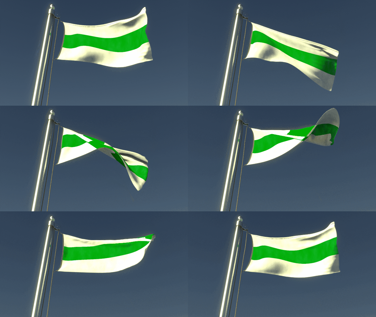
I’m working on a tabletop RPG project which imagines if Robert Kirk’s “The Secret Commonweath of Elves, Fauns, and Fairies” (1815) had a scientific enlightenment and became a democratic republic. One of my questions: what would the flag look like?
It must be simple, easy to recognize, iconic, and (most important) modern, since my Commonwealth of Summerland is an early modern society. Musketeers instead of knights and crusaders. And instead of kings and nobles, there’s an elected senate and a charter of human rights. So, the flag must have no mediaeval heraldry, no excessive ornaments, no fanciness-for-the-sake-of-fanciness.
At first I thought of making a variation of the sun flag seen in the 1973 film The Wicker Man: simple, iconic, easy to recognize, clearly evoking values like life, happiness, magic, goodness, fertility. But then again, a variation on that theme might seem too cliché. (And, anyway, the community of Summerisle did conspire to kill that policeman…)
Looking further: I took inspiration from the flag of France: a revolutionary flag, in which the colours of the city of Paris close in on the white of the monarchy. That design became a template for modern nation-building around the world for generations to come.
I also took inspiration from the flags used by present-day anti-war and anti-corruption activists in Belarus and in Russia: white, with a red bar horizontal across the centre (Belarus) or a blue one (Russia; it’s the Russian flag with the blood removed). This fits with the history of the fantasy world I’m creating.
The flag of France could also be interpreted as representing the revolutionary values of liberty, equality, and brotherhood. My flag should represent something comparable. I had already created a draft of the Summerland Charter of Rights and Freedoms, but I had not yet simplified it down to a motto. What did my fairyland revolutionaries fight for? Liberté, fraternité, egalité? Peace, order, and good government? No taxation without representation? Or did they rally to a motto like the one used by the 1968 Paris Uprising? “L’imagination au pouvoir!” All power to the imagination— the ability to imagine a better world.
My Summerlanders want freedom, safety, inclusion, optimism, knowledge, beauty, love, all the good things in life that everyone wants. Most of all they want life: the value that underlies and makes possible all other values; the one value which, quite literally, no one can live without. They want life to overcome the Spiral of Tyrants. Their revolution, both scientific and cultural, began when they discovered they live on a planet with a sentient ecosystem. Thus I hit upon the motto. Life always overcomes.
That motto immediately suggested to me that the flag needed only two colours. A colour for life, and a colour for that which life always overcomes.
Thus I wanted the colour green, because it’s a symbol for life recognized around the world: the green of forests and farms, the green of trees, grasses, and vegetables. But green would fade into the background in my Summerland: an army on the march through the forests and meadows of the Thousand Valleys, for instance, could raise the flag on the road, and from a distance it would look like they raised a burlap sack. So the flag should be visible: it can’t disappear into the background.
The colour for what life always overcomes seemed obvious, when I considered that design requirement: it should be white. Green and white make for a sharp contrast with each other; and one of them will contrast with any background. The flag would be instantly visible. White can represent the clean, orderly, perfect, monological, sterile, oppressive, and stagnant world created by the Tyrant Kings. Green, representing the messy, organic, growing, changing, diverse, ecological, inter-related, inter-dependent, and above all living world of Summerland, cuts across the white, always overcoming it.
As it happens, the map of my Summerland fits this flag as well. The territory of the Commonwealth is an area called The Thousand Valleys, bordered on its north and south by mountain ranges. So this flag fits the fictitious geography, too.
I considered whether to add a white rose to the design: a nod to the German anti-Nazi resistance movement of WW2. I may still do so later. But now I had a design I was completely happy with. The design you see here.
Maybe someday, if my novels, philosophy books, and games become more popular, people might put this flag on their T-shirts, or sew it on the arms of their jackets, or hang it from their booths at fantasy and science fiction conventions. Maybe if they’re asked what it means, they’ll say it means they believe that life overcomes oppression: and that this is an aspiration as much as it is an observable fact. I know it’s too much for me to hope for. I am a simple nerd with more critics than supporters, and I’m shouting into a gymnasium full of people shouting at each other. But one can hope. Life always overcomes. It is a motto of hope.

